
|
Title - One Sunny Day
Size - 91.44 x 91.44 cm Medium - Acrylic paint on canvas Completion - May 2022 Exhibition TextOne Sunny Day is a self-portrait piece inspired by Impressionist artist Claude Monet's Woman with a Parasol. While Monet paints a sunny scene with his wife and son as the subjects in his work, I've chosen to make the only subject me. The painting depicts myself taking a walk in a field, and was meant to sort of emulate a spring memory. As the painting reminded me of nostalgic days, I intended to try and convey that same warmth Monet does, through the use of bright and contrasting colors.
|
Inspiration
|
Claude Monet
Monet was an Impressionist painter, focused on color and feeling rather than accuracy of detail. He often used contrasting and bold colors that blend together to the viewer's eye when seen from a distance. Woman with a Parasol was a piece depicting Monet's wife and son on a stroll outside. The umbrella casts a shadow on his wife, allowing him to play with light and shadow. The light source can be seen through the contrast of light values at her back. Monet uses blues and yellows on her dress, reflecting the yellow flowers and the sky. Her and her son's features are less detailed but still accurate. The clouds are a mixture of grey, white and blue paint, and Monet creates texture through the fragmented clouds. The scene he paints is peaceful, a casual outing on a sunny day. I was drawn to this painting because of the feeling and it reminded me of spring, when I would just be walking with my family. I liked the colors Monet used, and the way the blue sky and yellow flowers sort of reflect on the dress of his wife. His brushstrokes were also interesting to look at, how it's not neat and are visible to the viewer on how he painted his work. |

Woman with a Parasol
|
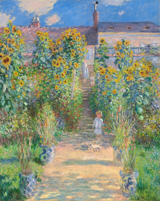
The Artist's Garden at Vétheuil
|
Planning

|

|
I drew a starting sketch of the work, just to understand and give myself a general idea on what to do. I figured out that the wind went left, and also decided to exclude the boy in the painting. This is because since it's a self portrait, it wouldn't really make sense for me to have someone else in my painting. I tried to understand how the folds of the skirt worked using the original work, and it was helpful in learning on where to have the lines and shading. I also sketched in my face, and drew the features and hair. Monet's work wasn't detail orientated, so I followed that and didn't detail my head sketch too much when it came to the facial features. I drew my eyes relatively simple, and kept just the main features. My hair was also drawn according to the wind, sort of softly blowing. I drew the hand holding the umbrella, and it was tough figuring out the position of the fingers. My second sketch, under the first, was more successful and I figured out how to draw the hand.
For my second sketch page, I drew the shape of the clouds to understand the shape better. They were mostly fragmented, with some small pieces floating around. I looked at my reference image and separated the blue and yellow into shapes, and this helps me better figure out on how to paint the clothes. I did the same with the skirt, labelling the sections of it and broke down the pieces. The umbrella was mainly dark green on the far left and right side, and in the middle, the colors would be a more teal hue. I shaded in the handle to add contrast and to see where to position it. Next, I was also thinking about how to position the pieces of the work. I wanted to figure out Monet's composition and find a better understanding of where he positioned his figures and general guidelines for how much space a part of the background took up, or how tall his wife was in the painting.
For my second sketch page, I drew the shape of the clouds to understand the shape better. They were mostly fragmented, with some small pieces floating around. I looked at my reference image and separated the blue and yellow into shapes, and this helps me better figure out on how to paint the clothes. I did the same with the skirt, labelling the sections of it and broke down the pieces. The umbrella was mainly dark green on the far left and right side, and in the middle, the colors would be a more teal hue. I shaded in the handle to add contrast and to see where to position it. Next, I was also thinking about how to position the pieces of the work. I wanted to figure out Monet's composition and find a better understanding of where he positioned his figures and general guidelines for how much space a part of the background took up, or how tall his wife was in the painting.
Process & Experimentation

|

|

|
I first started off with a wash of blue and green. I wasn't sure how much water to add to the paint, so I kept adjusting the ratio for the blue part of the wash. After I let the wash dry, I sketched in myself and at first, I had to constantly adjust the head size so I could have space to draw the rest of my body. But once I figured out the sizing, I was able to do the rest. I started with painting the sky, using a mix of cadmium blue and titanium white. I did pure blue at the top, and then mixed with white as I went down, creating an ombre. I painted in the clouds along the way and used my brush to add texture and emulate the look of clouds. I did this for the right side first since I wanted to figure out how to do the clouds as a sort of test run before going to the larger left side. The same thing was done for the left side, only I started to add neutral gray and some bits of yellow to the clouds to follow how Monet did. When the sky was done, I started on the skin and used peach mixed with some gray.

|

|
I painted in the rest of the skin and added the features with a dark brown. It was difficult to try and blend without erasing the features too much or changing the skin color. Then I started on the hand, which was easier to do and didn't take long. After finishing most of the skin portion, I did the hair with the same brown. I just did a solid color for the hair, and repainted some parts of the skin once I did the hair. The white shirt was next, and I used mainly neutral gray with a mix of cadmium yellow and cadmium blue. There was a lot of experimenting with the color mixture and just how much blue and yellow to use, along with where. I used pure gray to outline the collar and give that contrast.
The skirt was next, and I used pink with crimson red as the shading for the folds of the skirt. Initially, I wasn't sure if the red would fit for the shading, but after I blended it with the pink, I found it worked out well and did the rest of the skirt. I added blue and yellow to follow Monet's technique and tried to balance the vibrancy of the colors on the skirt. I experimented with them, and then added pink to make the blue and yellow more subtle. For the next section, which was the umbrella, I started with a mixture of green and lime green. blending the colors in and trying to find a balance between the two. I also used teal to create the bottom part of the umbrella, and then used green to create the shape of the umbrella. Afterwards, I painted the top part pure white and left it at that. For the grass, I mainly used green with yellow, sienna brown, scarlet, cadmium blue, white, and then neutral gray. First I just used green, and then mixed in the yellow as I went. I tried combinations of green with the neutral gray and white to see how the light green would work, and it was fine. I added sienna brown and scarlet in some spots as Monet did, and some occasional blue. The shadow spot was mostly just green with cadmium blue, along with the sienna brown and some spots of yellow. I also painted the yellow flowers in, painting them as small dots and lines. I had started with the right side and then gradually progressed to the left, using a mixture of gray, white and yellow for the light parts on that side. I finished with painting the rest of the yellow flowers on the left side of the grass.
The skirt was next, and I used pink with crimson red as the shading for the folds of the skirt. Initially, I wasn't sure if the red would fit for the shading, but after I blended it with the pink, I found it worked out well and did the rest of the skirt. I added blue and yellow to follow Monet's technique and tried to balance the vibrancy of the colors on the skirt. I experimented with them, and then added pink to make the blue and yellow more subtle. For the next section, which was the umbrella, I started with a mixture of green and lime green. blending the colors in and trying to find a balance between the two. I also used teal to create the bottom part of the umbrella, and then used green to create the shape of the umbrella. Afterwards, I painted the top part pure white and left it at that. For the grass, I mainly used green with yellow, sienna brown, scarlet, cadmium blue, white, and then neutral gray. First I just used green, and then mixed in the yellow as I went. I tried combinations of green with the neutral gray and white to see how the light green would work, and it was fine. I added sienna brown and scarlet in some spots as Monet did, and some occasional blue. The shadow spot was mostly just green with cadmium blue, along with the sienna brown and some spots of yellow. I also painted the yellow flowers in, painting them as small dots and lines. I had started with the right side and then gradually progressed to the left, using a mixture of gray, white and yellow for the light parts on that side. I finished with painting the rest of the yellow flowers on the left side of the grass.
Critique
|
|
|
The similarities are that the composition is generally the same, the figure near the center and the grass taking about a third of the painting. I used the same background, with the blue sky and fragmented white clouds, to have my work be reminiscent of the original. I also used gray on the clouds with bits of yellow to follow Monet's techniques, and the blue and yellow on the sleeve to reflect the colors, as well as patches of blue and yellow on the skirt like in the original. There's also the green of the umbrella, with bits of blue in the middle and dark green to outline the wires of the umbrella. The figures in both works aren't as detailed when it comes to the face. The grass includes bits of yellow, dark green, blue, a warmish gray color, brown, and red. The yellow flowers overlay on top of the skirt, and the shadow on the grass is similar. The brushstrokes are comparable as well; we both use larger brushstrokes and gradually build color.
The differences are that I have my hair, the wind blowing it to the left, while Monet's wife seems to have hers in a bun with a veil over it. I didn't include the veil in my piece because I didn't see it as something I would wear. Her skirt is also white, while mines is pink, and I chose to make the skirt pink because I felt like the pink worked better for spring. The blue tie around her neck isn't included in my piece. There's also noticeably no second figure in my work because of the idea of a self portrait, so it wasn't really necessary to include someone else.
The differences are that I have my hair, the wind blowing it to the left, while Monet's wife seems to have hers in a bun with a veil over it. I didn't include the veil in my piece because I didn't see it as something I would wear. Her skirt is also white, while mines is pink, and I chose to make the skirt pink because I felt like the pink worked better for spring. The blue tie around her neck isn't included in my piece. There's also noticeably no second figure in my work because of the idea of a self portrait, so it wasn't really necessary to include someone else.
Reflection
I liked doing a new way to paint, with using messier brushstrokes and trying to figure out how the contrasting colors worked. My favorite part was painting the sky, since there was just something about doing it that I just liked. There wasn't too much pressure to get everything precise, and I liked the textures I made with my brush. Referencing the original painting helped me see how to mix the colors, and a general idea of what colors to use. My least favorite part was doing the face, since the blending was tricky and I didn't want the skin color to change too much when I had to blend the brown. The contrast of the blue and yellow on my sleeve was nice, and it turned out better than I expected, just needing to be repainted a few times before I got it right. Another thing that turned out well was the grass, since at first I was unsure on how to do it. There were some points during the process where I doubted myself, but I pushed through and used the original to guide myself.
ACT
1. Clearly explain how you are able to identify the cause effect relationship between your inspiration and its effect on your artwork?
I tried to emulate some of Monet's experimentation with color and the focus on not so much the detail, but on the feeling of the piece and the colors.
2. What is the overall approach the author has regarding the topic of your inspiration?
The Impressionists' way of less detailed brushstrokes and not necessarily accurate color choices gave them more freedom on how to better express the meaning of their work. Monet's light and shadows contrast more with the use of contrasting color and not just value.
3. What kind of generalizations and conclusions have you discovered about people, ideas, culture, etc. while you researched your inspiration?
Monet was keen on exploring the use of color and breaking away from most of the conventional art ideas at the time.
4. What is the central idea or theme around your inspirational research?
The central idea/theme was to do a work that wasn't just a closeup portrait, but also include some sort of detailed background and to explore new ways of painting. I wanted to explore more ways of conveying an emotion.
5. What kind of inferences did you make while reading your research?
Monet's use of bright and contrasting colors, rather than accurate detail, gave his paintings a warmer feeling.
Citations
“The Artist's Garden at Vétheuil.” Art Object Page, National Gallery of Art, https://www.nga.gov/collection/art-object-page.52189.html.
“Woman with a Parasol - Madame Monet and Her Son.” National Gallery of Art, https://www.nga.gov/collection/art-object-page.61379.html#overview.
Duncan, Alexandra. “Claude Monet Paintings, Bio, Ideas.” The Art Story, 22 Nov. 2011, https://www.theartstory.org/artist/monet-claude/.
“Woman with a Parasol - Madame Monet and Her Son.” National Gallery of Art, https://www.nga.gov/collection/art-object-page.61379.html#overview.
Duncan, Alexandra. “Claude Monet Paintings, Bio, Ideas.” The Art Story, 22 Nov. 2011, https://www.theartstory.org/artist/monet-claude/.
