
|
Title - Retreat
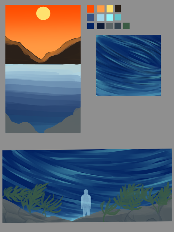
Size - 21.77 cm x 14.51 cm Medium - Digital Completion - August 2022 Exhibition TextRetreat is a digital painting inspired by JMW Turner's The Slave Ship and the Romanticism movement. It depicts a still sunset at the top, and a chaotic underwater scene. The message behind this piece is about conformity, society's values, and the depth of the sea showing a more alive world that may be chaotic, but comforting to the figure, who's meant to represent those who feel like they have to always act differently in order to protect themselves.
|
Inspiration
|
JMW Turner
Turner was a Romantic artist with a focus on landscapes and color. Many of his paintings feature the sea or a body of water. He's known for the way he renders light, giving an almost ethereal look to his pieces. Romanticism itself focuses a lot on emotion, color, and a focus on the sublime. Another portion to Romanticism was using art to convey social issues, such as Turner's The Slave Ship being used as a means to talk about the abolition of slavery. There wasn't a lot of focus on complete accuracy, but rather to the feeling of the piece and what the colors could convey to the viewer. Turner's art and the ideals behind Romanticism inspired me to think about a piece that could convey or be a metaphor for a social issue, while being a seascape. I liked the way the power of nature is conveyed in The Slave Ship, consuming the people in the painting. It very well conveys that sublime feeling, the grandeur of the vast sea and how its depths swallow the figures. Any person in my work would be small, with the scale of them emphasizing the ocean. There's also a sort of glow to Turner's works, so I wanted to incorporate that in in some way with light. |

The Slave Ship
|

The Fighting Temeraire
|
Planning

|

|
|
I started with writing out the ideas I had for the piece. I knew I wanted to do something with duality, about society's values and the conformity of that. I wanted to start with a warm sunset at the top, and then gradually fade to cooler hues, which I thought would help highlight the contrast. I was thinking of adding waves and fish to the ocean, to give it movement and a sense of chaos. The main idea of composition in my first sketch was to show the contrast of something more perfect to a more real, or alive, part. After I drew the horizontal sketch I began to think that a vertical one would be better to show off the depth, and showing the bottom of the sea and adding kelp plus rocks would help. I looked at a few pictures of kelp and drew a leafy one versus one with more wavy leaves.
For the second sketch page, I tried a vertical composition and liked it more. For the mountains in the background, I was thinking of adding warm lighting from the sun to give it more of a glow. The lower half of the work would be more detailed, and I was thinking that it would make it more lively, with the contrasts of color and the movement compared to the top half. The fish could've been lighter silhouettes against the sea, and wouldn't be in front perspective-wise, more vague shapes. To further help with that sense of lighting, I wanted to add a lighter teal-ish color at the bottom. Bits of bright purple, blue, and yellow would be more interesting to look at, and I contemplated adding a person in to better tie into the meaning of my work. They'd simply be standing at the bottom, calm. I didn't think I would make them detailed, more vague like the fish to represent multiple people. The third sketch page was done digitally, to see how the waves could look. I blocked out the potential base colors of my work to get more of an idea of the colors I could use. I experimented with the direction and colors of the waves using a teal color. I found it paired with the dark blue nicely, and I also made a palette of all the colors I used so I could have a reference for my final work.
For the second sketch page, I tried a vertical composition and liked it more. For the mountains in the background, I was thinking of adding warm lighting from the sun to give it more of a glow. The lower half of the work would be more detailed, and I was thinking that it would make it more lively, with the contrasts of color and the movement compared to the top half. The fish could've been lighter silhouettes against the sea, and wouldn't be in front perspective-wise, more vague shapes. To further help with that sense of lighting, I wanted to add a lighter teal-ish color at the bottom. Bits of bright purple, blue, and yellow would be more interesting to look at, and I contemplated adding a person in to better tie into the meaning of my work. They'd simply be standing at the bottom, calm. I didn't think I would make them detailed, more vague like the fish to represent multiple people. The third sketch page was done digitally, to see how the waves could look. I blocked out the potential base colors of my work to get more of an idea of the colors I could use. I experimented with the direction and colors of the waves using a teal color. I found it paired with the dark blue nicely, and I also made a palette of all the colors I used so I could have a reference for my final work.
Process & Experimentation

|

|

|
I started out with blocking my colors in, using a gradient for the sea and the sky. I separated everything into layers so I could do effects later and edit them as necessary. I used the line tool to make the outline of the mountains, and then colored it in with the fill bucket. I softened the sharp edges by painting over them. The first part I rendered was the sky, using a pastel yellow with a light orange for shading. I started with a circular shape and then worked my way into erasing and shaping the clouds. Afterwards, I proceeded with the mountains and used an airbrush tool to give the orange glow, then painting in the lines and separating the mountains. When I was doing this, I came up with the thought to add another layer to them. Originally, it was just going to be one mass, but I made the bottom parts that meet a lighter color to add some more depth to the piece. The sun was made using the glow effect and airbrushing a yellow circle before using white to make it brighter.
For the sea, I added a yellow gradient at the top to better reflect the light, and then used a slightly darker shade of blue to paint in the ripples, and pastel yellow for the highlights. I started on the bottom part next, and blocked in the rocks after I added the teal gradient. After creating the waves, I drew the fish and a whale, and then duplicated the fish so it would be easier.
For the sea, I added a yellow gradient at the top to better reflect the light, and then used a slightly darker shade of blue to paint in the ripples, and pastel yellow for the highlights. I started on the bottom part next, and blocked in the rocks after I added the teal gradient. After creating the waves, I drew the fish and a whale, and then duplicated the fish so it would be easier.

|

|
With the waves I added lines of purple and pink to them using the glow function. This helped to make the colors pop out more, and then I started to render the rocks, adding darker lines to separate them. The kelp was drawn out with just its base green color before I went back and added shading for depth. The last part I drew were the bubbles, staring with white circles before using the transparent color. Some of the bubbles I copy and pasted, but most of them were drawn by hand. The last few steps were color balancing and using a gradient map to make the colors brighter.


|


|
Experimentation
Most of my experimentation was figuring out the waves and he direction they were going. I did them on a separate layer because I wanted to first see if I liked the result before making it my final. The first one was done with a smaller size brush, and followed my sketches of flowing lines. I didn't like it though, since I felt there was too many lines. So in the second one, I opted for a larger brush size and tried the same as before. The idea of making the lines form a tornado came to me, and so I wanted to see if I would like it. I wasn't quite satisfied with the positioning of it, and in the third image, I tilted the lines to see if it was any better, and found it was, but not quite enough to use as the final one. So I tried again with the lines like in the first picture, alternating the brush size at pints, and I thought the fourth attempt didn't feel quite right. I tried the same thing again, and eventually I thought it was good enough for me. The other thing that was experimental was the bubbles. After finishing most of the painting, I thought the sea felt empty, like it was missing something vital. To fill the space in, I tried doing bubbles and found that it was a good idea. |
Critique
|
|
The Slave Ship
|
Similarities
The similarities between my work and Turner's is the meaning, which is based in a social issue. Turner's is about the abolition of slavery, while mine is about societal norms and the fronts people put on to hide their "undesirable" qualities. Our works are both seascapes with a warm sunset, movement shown with the waves. The human figures in the pieces are dwarfed by the sea, emphasized by scale to show the grandeur, and images of fish are included. The warm colors of the sunset are contrasted by the cooler hues of the ocean. Overall, there's a sort of chaotic feeling to both works emphasized by movement and scale.
Differences
Turner uses oil paint on canvas, while I use a digital medium. I preferred doing digital because I would be able to use effects like adding glow and using gradient maps. My human figure is more so a vague shape, while Turner's are more realistic. This is because the figure in my work is more representative of multiple people. Turner's subject matter is darker, with the fish eating the slaves as they try to cling on to life. His colors are less saturated, muted and darker than the brighter hues of mine. The Slave Ship also doesn't feature any underwater perspective, it's mainly just the surface of the water that's visible to the viewer. My piece has a vertical orientation to reflect that depth, while he uses a horizontal one.
Reflection
One reason I did this work was to practice more with landscapes and backgrounds in general. I'm not used to doing them often, and while I have had some experience with painting the surface of water, I've never done underwater painting. I will say that a study I did once a while ago helped me with the mountains, and I think it really benefitted me when it came to that portion. The mountains, plus the sea, were my favorite parts to do because they looked nice to me considering my lack of experience. While the bubbles were tedious to do, they helped me figure out what was missing in my work and improved it. The only part I would redo would be the sky, just to add more color rather than having an orange gradient. While my work isn't too closely reminiscent of my inspiration, I think most of the similarities comes from the meaning behind it, as well as some of the ideas in Romanticism. Overall, I like my final result, and it was a good learning experience when it came to backgrounds.
ACT
1. Clearly explain how you are able to identify the cause effect relationship between your inspiration and its effect on your artwork?
I was inspired by many of Romanticism's ideas of talking about social issues, the sublime, and Turner's use of color to create a landscape that would showcase those ideas. The Slave Ship in particular inspired me with the meaning behind my work.
2. What is the overall approach the author has regarding the topic of your inspiration?
Turner uses the idea of the sublime to emphasize the ocean's power and to bring attention to the issue he's calling out, and the destruction of the ship in The Slave Ship plus the slaves themselves shows the cruelty of the topic.
3. What kind of generalizations and conclusions have you discovered about people, ideas, culture, etc. while you researched your inspiration?
The sense of scale is quite effective at conveying ideas and giving more power to the art in a way. The ocean makes the human figures in it almost powerless compared to its vastness.
4. What is the central idea or theme around your inspirational research?
I wanted to do a piece with more of a background focus while still retaining my theme of a prime emotion, so JMW Turner seemed like a good artist to get inspiration from.
5. What kind of inferences did you make while reading your research?
Landscapes can also provide a lot of meaning and purpose, and not just art focusing around the human figure.
Citations
“Joseph Mallord William Turner, the Fighting Temeraire.” Joseph Mallord William Turner | The Fighting Temeraire | NG524 | National Gallery, London, https://www.nationalgallery.org.uk/paintings/joseph-mallord-william-turner-the-fighting-temeraire.
“Slave Ship (Slavers Throwing Overboard the Dead and Dying, Typhoon Coming On).” Slave Ship (Slavers Throwing Overboard the Dead and Dying, Typhoon Coming on) – Works – Museum of Fine Arts, Boston, Museum of Fine Arts Boston, https://collections.mfa.org/objects/31102.
“Slave Ship (Slavers Throwing Overboard the Dead and Dying, Typhoon Coming On).” Slave Ship (Slavers Throwing Overboard the Dead and Dying, Typhoon Coming on) – Works – Museum of Fine Arts, Boston, Museum of Fine Arts Boston, https://collections.mfa.org/objects/31102.
