
|
Title - Home Sweet Home
Size - 16.93 x 21.16 cm Medium - Digital Completion - March 2022 Exhibition TextHome Sweet Home is about how a safe place, most often a home, can become terrifying after a traumatic event. This work was partially personal to me in its meaning. Inspired by Trevor Henderson's work, the piece includes a looming figure, hands reaching out towards the man as a representation of this fear. That fear haunts him as he looks at photographs of a time before that event, of a person he lost.
|
Inspiration
|
Trevor Henderson
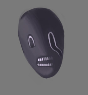
Trevor Henderson is a horror artist well known for his found-footage type works, in which a cryptid can often be seen looking at the viewer. The beings are often uncanny looking, bringing an unsettling feeling to the work. I was inspired by this because they're not something you'd usually find in a generic horror movie, like a monster with claws and teeth, something that would look scary but not memorable. Henderson instead chooses to utilize that uncanny valley of human-looking but incredibly warped features. The blurry photos also add to that off-putting feeling because of how real it feels and not something taken in perfect quality. He uses contrast to either make the monster the central figure of the piece, or to obscure it and make it blend in with the background. I wanted to make a piece using that same uncanny kind of monster, to make that fear lurking in the piece rather than an in-your-face kind of fear. |

|

|
Planning

|
I was thinking about how to show that tension, or where to place the entity exactly. I decided to go with my inspiration photo and place it at the doorway, looking into the bedroom. I thought it would give the creature enough focus and have the man placed next to it as well, centering them. The figure having a humanoid face with a warped eye would give it that human-esque quality Trevor often chooses for his designs, and I was also thinking about adding teeth to increase the uncanniness. Skinny, spindling arms would be perfect to show that fear approaching the person and slowly making its way to him. The fetal position is a vulnerable pose, and looking away from the monster or at it would add to the horror aspect. Another idea for the composition was to have only the monster's eye peeking in since it was more suspenseful.
|
|
I experimented with slightly different compositions to see what ideas I liked. The first image is straight, while the second has more of an angled view. I added images to the second to fill up the space and also thought about giving the viewers some context for this piece, and to add to the meaning of it. The polaroids or photos could show images of people or general scenery, images you could find decorating a home. I thought about the concept more and figured it would be a way to show life before that traumatic event, surrounding the man in memories he can't escape. For the man's expression I was initially thinking on fear, but a wistful/sorrowful face could work better. Since the representation of fear is more a symbolic idea than a literal monster, it would fit more to not acknowledge it directly.
|

|
Process & Experimentation
|

|

|
I started with experimenting on how to do the face of the figure, sort of seeing how the blending would work and where the eyes would go. I also wanted to see how light would affect the features and the mood of the figure. After finding the result satisfactory, I went onto my final piece using the program Clip Studio Paint. The first thing I did was to make the background so I could plan on where to place things, using the line tool to make things look neater. Then, I used a reference to get the pose down, and afterwards made a clean sketch and added the hair and clothes. I gave him just a plain t-shirt and jeans since I didn't feel like anything special would be necessary. The long hair was fun to draw, and it kind of further emphasized the weight of his head hanging down. Adding some strands of hair on the head made him look messier, a bit disheveled along with the eyebags. The colors were a little tricky, considering the person would be encased in darkness, so I tried different color combinations and eventually settled on colors that looked good together. Henderson's work uses desaturated colors and darker values, so I also tried adhering to that.

|

|

|
I colored in the background, and then the photo colors. I wanted the photo colors to be the most saturated part of the piece for emphasis. I shaded in some parts of the skin, then the hair, shirt, and legs. After that I added some shadows to the background and some rough colors to the photos. Since the photos were going to be small and mostly obscured, I decided making it less detailed would save time. The shading on the curtains and bed were quick to do, and then I thought of adding the man's shadow to make the piece more complete. When everything about the background and the person were done, I moved onto the figure itself. Using just a plain almost-black color, I blocked it in and then erased around the edges to clean it up. It was difficult trying to find on how to add enough detail to the monster and define its shape better, and trying not to give it too much detail. So I added lighting and it worked out. It gave me a way on making the shape more detailed and just vague enough. When I finished everything, I added in a grainy RGB texture and set it to overlay, then lowering the opacity. The texture was perfect for giving the look Henderson's work has, and I also wanted to use chromatic aberration. A tool I downloaded made the process easy, and I dragged the red and blue levels until I got the effect I wanted.
Critique
|
|
|
Similarities
Both our works use a figure standing in the doorway, looking at the viewer. They seem to loom over the person, with uncannily large eyes and a skinny body. Both pieces also take place in a bedroom, a place meant to be safe. The colors are desaturated, with darker values and low contrast. The composition has them as the focal point and they're emphasized through contrast and proportions. Me and Henderson both use a grainy RGB texture and chromatic aberration to add effect to the piece.
Differences
The differences are that my work has more of a symbolic meaning than the literal one Henderson has. Henderson's piece is mostly a cryptid, exploring the terror in an unexpected visitor at night. Our monsters are different in color, with mine being entirely shadow, a dark figure with long arms. His is fleshy, with a mouth and shorter arms. My piece's meaning relates to trauma and how it changes our view of places. My piece also features a visible person, something that Henderson doesn't usually do because the viewer themselves is supposed to be inserted into the piece, to experience the horror. In my work, the viewer is supposed to see the event as an observer only and not be as if they were experiencing the piece. Henderson also uses photos for the background, when I drew mines because I wanted to get a specific composition. I wanted to get that person behind the door, hiding, while his composition has the viewer on the bed with the cryptid opening the door.
Reflection
Overall, I liked the piece. It was definitely new for me to try drawing horror, and I think it went well. While the figure in my art isn't as scary as Trevor Henderson manages to make his cryptids, it was fun to draw and try to explore what features to distort. My favorite part was drawing the person, because the reference I used made him turn out well. Another favorite part was adding the textures and filters to my art since it made the work complete and added to the atmosphere. My least favorite part is the background, since it felt incomplete in a way. The meaning of this piece changed how I thought about things, and my initial concept wasn't the same as when I started. Henderson had a lot of aspects to his art that I wanted to try and copy, and I did take a lot of those aspects into mines, but I strayed from just doing horror and instead went into symbolism.
ACT
1. Clearly explain how you are able to identify the cause effect relationship between your inspiration and its effect on your artwork?
Trevor Henderson affected the design of my figure and the kinds of features I wanted to draw, since the effects he uses and the designs he has struck a chord in me.
2. What is the overall approach the author has regarding the topic of your inspiration?
The idea of being face-to-face with something unnatural, a being with human features distorted all wrong can be effective in horror.
3. What kind of generalizations and conclusions have you discovered about people, ideas, culture, etc. while you researched your inspiration?
People feel more terrified with horror that takes them, the viewer, into the art itself. The setting of a usually mundane place invaded by something off becomes more personal to them.
4. What is the central idea or theme around your inspirational research?.
The central theme is the idea of trauma or fear haunting someone, becoming an inescapable presence as they're forced to confront it in a place they once felt safe in.
5. What kind of inferences did you make while reading your research?
The contrast and the intentional quality of art can contribute to how it's seen and the atmosphere it brings into the piece.
Citations
Henderson, Trevor. “Photo Work.” Trevor Henderson, https://trevorhenderson.format.com/photo-work.
